.png)
.png)
Selling your SaaS product is an approach that requires knowing how to reach, convert, and retain your customers. The growth funnel of a company has 5 phases: awareness, engagement, conversion, closing, and retention.
Central to this funnel is your website, serving as the platform for customer engagement and conversion. Keeping this in mind, you need to understand that directing traffic to a poorly designed website is not only a waste of time but also a drain on resources.
Closing and retention depend on engaging and converting customers. So, focusing on your website conversion strategy is really important.
The significance of a website goes beyond its design and layout. It serves as the very foundation for your online presence. Think of it as a 10-second elevator pitch. While the visitors that come to your website may stay longer than 10 seconds, it only takes an average of 50 milliseconds for them to form an opinion about you.
In an environment where over 96% of content gets no traffic, building a high-converting website can feel like climbing a mountain. This is why we are here to help you.
In this article, you’ll learn what to consider when building a website, what the high-converting website framework looks like, and what features every high-converting website has.
Let’s get started:
Three Considerations When Building a High-Converting Website
When you want to increase your conversion rate, there is nothing more important than getting your website right. And when we say getting your website right, we don't mean "getting it right" as in making it look nice and having it work well; we mean getting it right in terms of helping your customers understand what you do, why they should care about it, and how to buy from you.
So, to get the website right, you need to understand people. How they think, what affects their overall choices, and how they make their final decision. To get your customer better, there are three considerations you need to keep in mind: the law of pithiness, choice paralysis, and the principle of cost/benefit analysis.
Law of Pithiness
The law of pithiness is an old German principle that states that people have a tendency to order their experiences in a simple, symmetrical manner. This means that we, as human beings, tend to be more receptive to order and clarity and not so much when it comes to complexity. We love to make sense of the world around us, and deep down, we know that simpler things are less likely to lead to unpleasant surprises. We also reflect this tendency when it comes to website design.
All high-converting websites, whether knowingly or unknowingly, follow the law of pithiness. All of them have simple, clear, and orderly designs that maximize their conversion rate.
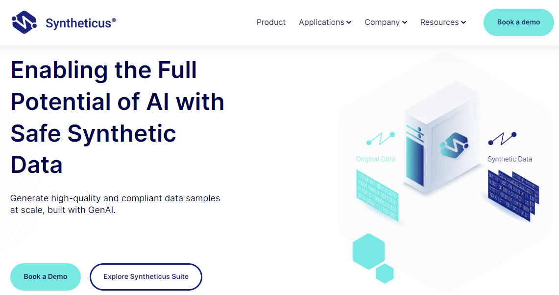
Take Synthethicus as an example. When we started collaborating with them we spotted that their homepage was filled with technical information, industry jargon, and confusing call-to-action buttons. It was too complex for their visitors. This is why we proposed to them we relaunch it and test a new, simpler version.
The website relaunch involved creating a conversion-driven and visually appealing website that covered all key aspects of their offerings and implementing a clear and simple design.
Just two months after the relaunch, Synthethicus's website surpassed 108,000 impressions worldwide. Here’s a link to the case study.
Choice Paralysis
People love choices, except when they have so many of them they become overwhelmed. This phenomenon is also known as choice paralysis or paradox of choice, based on the work of psychologist Barry Schwartz. Basically it means the more choices we have, the less likely we are to take action and less likely to be satisfied with our decision. The graphic below perfectly represents this paradox:
.png?width=1600&height=900&name=The-paradox-of-choice_Graphic2%20(1).png)
We see this choice of paralysis demonstrated on websites all the time. Think about it. There are so many websites following the recent trends of implementing hero carousels with multiple sliders for different content, featured resources or articles, and cluttered side callouts with so many CTA buttons.
Too many choices can quickly overwhelm your website visitors and cause your conversion rates to plummet. Luckily, there is a way to fix this problem, and here is how:
Simplify the Layout: Present options in a clear and easily comparable format, avoiding clutter and overwhelming details.
Streamline Information: Instead of bombarding visitors with exhaustive lists of features, condense the benefits of each option into concise and impactful points.
- Highlight Key Benefits: Focus on showcasing the most important and unique aspects of each product or service to help visitors make informed decisions.
- Limited Options: Consider offering a smaller selection of clearly differentiated choices to avoid overwhelming visitors with too many similar options.
- Clear Call to Action: Guide visitors with a clear call to action, directing them toward the next steps in their decision-making process.
A well-designed website provides website visitors with a clear and easy choice, allowing them to compare different options. As Gordon Ramsey always says, a smaller menu means the customers will be able to make an informed decision.
Principle of Cost/Benefit Analysis
The concept of cost/benefit analysis suggests that certain actions should only be taken if the benefits outweigh the costs. This concept is also useful when trying to determine the conversion rate optimization of your website.
Every interaction on a website involves a perceived cost and a perceived benefit. For example, subscribing to a newsletter may require minimal effort (cost) but promises valuable updates and insights (benefit). However, if the process demands extensive personal information or a lengthy registration procedure, the perceived cost may outweigh the perceived benefit, resulting in people not subscribing.
When applying this cost/benefit analysis, you can use one of Miro’s templates to best determine the perceived costs vs. the perceived benefits. There are three choices from which you can choose:
Decision tree template: This is a graphical representation of all possible outcomes, decisions, and costs and benefits. It helps to visualize the different options and their potential impacts.
Timeline template: This is a linear representation of the project or decision along with its associated costs and benefits over time. It helps in understanding the time distribution of costs and benefits.
Flowchart template: These are diagrams that visually map out the different stages, decisions, and outcomes of a project or decision. It helps in understanding the process and identifying all associated costs and benefits.
The Website Conversion Framework
What makes a website truly successful and efficient?
Most of the time, people have misconceptions and believe they have to spend an excessive amount of money to create a great website, or they need to constantly produce a lot of content for the website to achieve their goals. While this may be the case sometimes, it's not always necessary.
First, let's establish what a "successful" website means. To marketers, this could mean things like "good traffic," "low bounce rates," or "lots of keywords ranking well for SEO."
But if you want to measure the conversion rate of your website, forget about these vanity metrics. Measure things that matter, like buyer journey progression between key pages, time spent on key pages, traffic to conversion on book a demo page, or number of resources downloaded from your website. These are the KPIs a successful website needs to track.
To increase the number of these KPIs, you need to develop a website conversion framework that has 5 categories.
Let’s take a look at them:
.png?width=1600&height=900&name=website-conversion-framework_blog-image%20(1).png)
Platform & Tools
The first element of the website conversion framework is the platform and tools, which are foundational to your SaaS website’s stability and security. The platform and tools you use can make or break a high-converting SaaS website. Whatever platform you choose, whether it is HubSpot, WordPress, or Webflow, make sure it's easy to use from an editing standpoint and even easier to navigate.
Among these several platform options, we would recommend going with HubSpot, and here are a few reasons why:
Clear and intuitive interface: It offers a well-organized layout, user-friendly navigation, and minimalistic design, making its interface so much better than other leading platforms
All-in-one tool: It combines sales, marketing, operations, support, and business management tools all in one place. Additionally, it provides features for lead capturing, scoring, and nurturing through workflows and automated emails.
Integrated with CRM: It offers a built-in CRM that seamlessly integrates with its marketing, sales, and service tools, providing a unified view of customer interactions across the entire customer journey.
Marketing Automation Software: HubSpot’s marketing automation software streamlines your marketing activities, helping you increase the effectiveness and quantity of your campaigns.
No-Code Customizability: It is easy to learn and customize, eliminating the need for expensive development resources.
Do you need to rely on an experienced developer every time your website needs to update a plug-in? Is your website secure and safe? Do you need to rely on third-party plugins and developers just to keep it operational?
If it’s difficult to navigate through these factors, it's best to consider other options. If your website is not inherently easy to use for making updates and modifications without having to hire someone who knows how to code, it's probably not the right platform for your website.
Positioning & Messaging
This section of the Website Conversion Framework is arguably the most important one in terms of actual conversion. 95% of the success rate of your website conversion depends on the story you tell. So if your website tells the wrong story, is not saying what it needs to say, or focuses on your company and not the problems you solve, your chances of getting someone to become a user or subscriber are pretty low.
The sad thing is people spend ridiculous amounts of money on a website design but at the end of the day, they don’t take into account the buyer’s journey. This leads your visitors to a poor experience, one that is confusing and doesn’t deliver, and ultimately leads them to bounce or exit the site prematurely and never return. If you're not converting enough visitors into users or subscribers at the volume that your business needs, it’s an indicator that you have a problem.
The quick test to see if your website is providing the right messaging is this: if you are talking more about yourself and your products or services, what you know and why you’re a great company, your awards, how many years you’ve been in business, or how your features are the best thing in the world, then you're failing miserably. You must shift your focus and start talking about your customers, their problems, and how you can solve them.
Design & Development
The importance of design and development is often overlooked when it comes to websites. It's not just about making your website look pretty but also about considering the User Experience (UX) of your visitors. Do your visitors enjoy interacting with your website, or do they find it confusing and distracting? Have one that enhances your brand and the message you want to convey.
Your website should look presentable and encourage engagement in some form. You can achieve this in many different ways, but one of the easiest ways to enhance the UX is to ensure you’re creating opportunities that are built into the overall design of the site for lead capture. This could involve using forms, landing pages, and interactive elements such as calculators, quizzes, and chatbots.
Enhancing the user experience and engagement on your website is crucial for keeping visitors coming back for more.
Nurturing & Automation
Capturing leads is important, but keeping them engaged and guiding them through the buyer journey is what drives pipeline and sales.
Many marketers focus on collecting contact information and then simply forwarding those leads to the sales team or sending a few follow-up emails. But buyers don't always behave as we hope. They may not return to the website, book a call with the sales team, or request a demo. So, you end up with a database full of inactive contacts, which is essentially wasted resources.
The key is to engage them after you capture them. This is about delivering an ongoing experience. So, focus on crafting variety of compelling content that enhances their experience by addressing their problems, offering resources, and providing value.
But it doesn’t stop there. You can also segment your leads based on the types of companies they represent, their roles, and their specific pain points. Then, create specific pages on your website that address these pain points and set up email nurturing campaigns to engage them.
Lastly, if you can automate your pipeline by creating deals, you can make the whole website conversion process a lot easier. For example, you can instantly collect important information when someone submits a form and then use automation to deliver personalized content, set up appointments, and follow up with leads.
Traffic & SEO
While SEO is crucial for a successful website, it is often misunderstood and overemphasized by marketers. When marketers talk about SEO, they often point to increased traffic, better keyword rankings, longer time spent on the page, and higher page views as outcomes of their SEO efforts. While these are positive outcomes, they may not be the most critical.
Having a website that drives traffic is beneficial, but it's ineffective if that traffic doesn't convert into customers. It's like fueling a fire that isn't burning yet. While having a lot of traffic is great, what you do with the traffic you have is more important.
So, before paying attention to the traffic you generate, make sure you got the rest aspects of the website conversion framework right.
5 Features Every High-Converting Website Has
We talked about the things you need to keep in mind when building a high-converting website, the website conversion framework, but what about the features that make it high-converting?
Let’s take a look at them:
1. Compelling Hero Section
The hero section is the gateway to your website, setting the tone for the entire browsing experience. A compelling hero section not only grabs your attention instantly but also conveys the unique value of your product or service. Make sure it communicates:
- What do you have to offer?
- Why should people trust you?
- What are the benefits of working with you?
- What action should they take next?
2. Clear Calls to Action
As one of the many elements on a webpage, CTAs should not be an afterthought. They can make a significant impact. When done right, your CTA can mean the difference between a customer taking action or not.
Here are some tips you should consider for creating a high-converting CTA:
1. Offer compelling copy: A crucial aspect of your CTA button is the copy. It has to compel your customers to click. So make sure you clearly state what your visitors will get after they click your CTA, whether that’s a discount code or more information.
2. Prioritize clarity and brevity: CTA copy should be brief and straight to the point. Depending on who you ask, experts recommend using no more than two or three words, but you can also consider a longer phrase if it works for your scenario or if you want to stand out.
3. Make it action-oriented: Your CTA button should begin with an action verb or what some refer to as a trigger word, like “Get” or “Download.”
4. Create a sense of urgency: Creating a sense of urgency creates great results when implemented into CTAs. This can apply to limited edition products or a short-term promotion.
5. Make it impossible to miss and easy to find: Even if you’ve crafted compelling CTA copy with a great background color, it won’t matter if nobody sees it. Ensure your button is impossible to miss. It should be large enough to stand out on the page but not so large that it looks obnoxious or like spam.
6. Use contrasting colors: Designers and marketers are looking for the highest converting color, but no universal color is best for conversions. And what works for your competitor might not work for you and your brand." Instead of hunting for the magic combination, remember that people are more likely to notice and remember something that stands out from everything else around it.
7. Don’t double the CTA (usually): As we mentioned above when we talked about choice paralysis, people are less likely to act when presented with more choices. Understanding all the information, evaluating the options, and comparing them against each other takes so much mental effort that it's easier to choose nothing and move on to something else.
8. Test and optimize your CTAs regularly: To ensure your CTAs are as persuasive and visually appealing as possible, test them regularly with users. Even minor changes can have a significant impact, whether you’re changing the copy, size, color, placement, or style of your call to action button.
3. Growth-Driven Design
One of the bases of the growth-driven design approach is continuous website improvements based on real data and visitor insights. This method focuses on launching quickly with a smaller budget, allowing you to start gathering data and making informed decisions to enhance the website's performance and conversion rates.
By analyzing real user behavior and preferences, growth-driven design enables you to make targeted changes that lead to a seamless user experience, ultimately driving more revenue. This iterative process of improvement ensures that the website evolves to meet the changing needs of its visitors, resulting in sustained high conversion rates.
If you’re interested in learning more about GDD, we have some interesting factsheet that you can download: Traditional vs. Growth-Driven Design
And a complete pillar page that goes into every detail about it: Guide to Growth-Driven Design for SaaS
4. Problem-Solving Content
Creating content that resonates with your target audience requires a deep understanding of their pain points. To achieve this, you should conduct thorough research to identify the specific challenges that your audience is facing. This can involve surveying your current customers, analyzing social media conversations, or reviewing industry trends.
Once you've identified these pain points, create content that directly addresses them. This can take various forms, such as blog posts, case studies, pillar pages, or how-to guides. When crafting this content, demonstrate empathy and show that you understand the challenges your audience is facing.
To establish your authority in the industry, you should offer practical solutions to your audience's problems. This shows that you're not just trying to sell products or services, but you genuinely care about helping your audience.
5. Social Proof
Have you ever noticed how the actions of our peers influence our own? In fact, more than 92% of customers trust a recommendation when it's coming from a peer. This is the influence of social proof, which is easily one of the most important practices you can implement to convert website visitors into buyers.
Check this video that explains the into social proof principle of influence:
The reason why social proof is so impactful lies in the fact that it reduces the risk of the unknown. Seeing that other people have had a positive experience with a certain product or service makes us feel more confident in our own decision-making. Additionally, social proof can create a sense of belonging in a community of like-minded people, which is an additional motivator for our actions.
When you have a segment on your website that features the positive outcomes others have had with you, you instantly increase prospects' trust. This increased trust can ultimately lead to increased sales and a strong customer base.
There are two types of social proof you can use on your website:
Case Studies
A case study is an in-depth analysis of how your product or service solved your customer’s problem. In B2B SaaS, case studies serve as proof that backs up the promises you make to your customers. If potential customers see how you helped others who are in similar situations to theirs, you automatically have higher credibility in their eyes compared to the other alternatives they are also looking at.
Besides proving that your solutions are helpful, case studies also give prospects a glimpse of what it’s like working with you, which can be a determining factor in their decision to collaborate with you. After the conversation starts, you can provide any additional information or insights they might need to capture their business.
Customer Testimonials
The reason why customer testimonials are one of the strongest forms of social proof is because they clearly say to a visitor, “Your product has successfully solved a similar problem to mine for someone else.” When applying customer testimonials, add a few in a row or organize them into a carousel to make it easier for your visitors to navigate through the different quotes.
Another way to show customer testimonials is to use a review widget and embed reviews directly from a well-known platform like G2, Trustpilot, Google, Yelp, or other relevant review websites.
Conclusion
When creating a killer website for your B2B SaaS, it's not just about looks and functionality. It's about connecting with your audience, guiding them, and meeting their needs. Keep it simple, clear, and empathetic to boost engagement and conversions. Make it easy for your audience to understand and connect with your design. Streamline options for clarity and find a balance between value and effort in every interaction. Your website should evolve with insights and data, offering a seamless user experience and meaningful engagement. Drive traffic and optimize for conversions to make your website a dynamic conversion engine.
Remember, it's all about continuous improvement, empathy, and data-driven insights to ensure sustained growth and meaningful connections with your audience.